
Picture to be used of the band, although it will need to be lengthened at the top to make space for the CD front cover and the text.

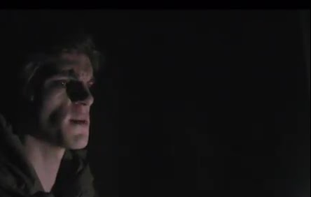


These are the images to be added in the back of the the magazine advert, to add more depth and create an ideology for the band, the images are still shots from the music video.

I started with a black background so that I could elongate the band picture.

I placed the band at the bottom of the image, I will add a mask later and use a gradient to merge the curtain background to the black background.

I cut around the band and put it in a separate layer above the other because the merge between the background and the band will merge the band too and will fade them.

This is the merged picture before the second layer has been added.

The second layer so now the band stand out against the merged background.

To make the compilation of still images from the band took one image at a time and put it on a blank background one layer at a time.

This is the finished set of images, there is a space at the bottom where the band are. I will fade all the images so they blend into the background so the focus remains on the CD and the band.

This is the the magazine so far, however the amount of the images in the background detract from the central images so I decided to take some of them out. I cut out some of the cross over points so the fade is the same all over.

The new background with some of the images removed looks better and less cluttered.

I added the band name/logo from the the front cover of the CD album to link the CD album to the music video. I also added a website to the bottom of the magazine advert.

I put in the image of the front cover between the logo and the band. I added some text "Out Now" to make the image look more like an advert. At this point this exactly what I wanted in my design, however some of my target audience I showed the image to said I could make the magazine look stronger by adding a link to another part of the CD album, the most notable suggestion was to add a black and white forest to the top and bottom edges of the image, similar to my third panel.

This is the image I used in my third panel that has been elongated to fit the size, I took out the colour and added contrast to darken the image.

I added a mask and faded the top and bottom edge to show the forest image underneath and finally added the album title.

This is my final magazine advert.
No comments:
Post a Comment