Sunday 25 March 2012

Question 4: How did you use media technologies in the construction and research, planning and evaluation stages?


Question 3: What have you learned from your audience feedback?

MUSIC VIDEO ANALYSIS

I had 21 people between the ages of 18-24 answer my questionnaire about my music video. 11 were female and 10 were male. Half of the respondents answered the questionnaire online using SurveyMonkey.com

When I asked if the music video held their attention 16 people said yes and 5 said sometimes, no-one said no. This means that the video mostly held the viewers attention so that it is an interesting video. 

The next question was how they rated the camera work and editing, 1 being the worst and 5 being the best. None of my respondents gave a 1 or 2, the most common answer was 4 which is a very good response as 5 is the best it could be and there is always room for improvement. 

This question was rating the mise-en-scene, again 4 was the common answer, although there were more varied answers. This shows me that most of the respondents liked the mise-en-scene I created in my music video, and the few that didn't like it as much may give a reason later in the questionnaire to as why. 


This question was whether the questionnaire takers enjoyed the music video, with the same rating system. This answer was the most varied with one person giving a one and another giving a two, the rest of the answers were mostly 4's and 5's which is very good for a music video. I did not give a box for the responders to write why in this part of the question but later I ask whether the music video was confusing or hard to understand which may give me some answers to the lower scores. 

I asked whether the questionnaire takers thought the music video was too long, too short, correct length or didn't know. 1 person said it was too short, 2 said it was too long, 3 didn't know and the remaining 15 thought it was the correct length. Most of my respondents thought the time was right while a few people were either side so I think that the song timing was the best it could be. 


"Would you watch the music video again?" most of the takers said yes, although some people said no or maybe, overall it was a positive response. This is a good response for a new band. 

I also asked if there were any offensive parts of the music video and all 21 responders said no so I know that the music video definitely has not offensive parts to it. 

Were any parts of the music video confusing or hard to understand? 
"i don't whats happening but i never do in music videos. the music suited the scenes and make up tho :)"
"What the soldiers were actually supposed to be doing."
"Who was on which side of the battle - the identical costumes made it difficult to distinguish between them."
"Is staz two characters or the same one"
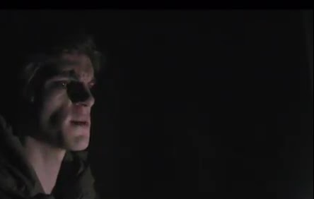
"The role of the dark eye man was ambiguous."
"No" x15
"Why they were in army clothes"

Most of the questionnaire takers understood the video, however there seems to be some confusion over the the cadets and Staz's role, to make this clearer I could have had the cadets or the ghost of Staz in black and white to differentiate between them. I could have also had the two cadet groups in different colours. But this may have been the reason why some of the responders didn't enjoy the video as much as they could have. 

Does the video reflect the style of the music? 
All of my responders said yes to this questions. So it reflects the metal genre and isn't confused with another genre. 

What was the best part of the production?
"costume"
"The ending #slowly turns away#"
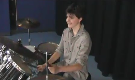
"Going between the story and band playing instruments." x3
"The use of slow motion and close-ups and the timing of switching between the band and the story."
"When the shots of people playing the instruments"
"The blending of the scenes from the forestry training camp to the artfully filmed band playing" x2
"The shot of the log falling and breaking"
"The scenery"
"Eye man's use of eyes in the very last scene."
"The best part was the ending when the soldier walked away from the camera as the music faded out. It was so haunting."
"Editing" x4
"Camera Angles"
"Story"
"Actors"

This was a varied array of replies for the question, I like that the responders found so many different things they liked about the music video. It also shows that different people appreciate different things in a music video and that I managed to please a lot of different people.   


Question 2: How effective is the combination of your main product with ancillary texts?


Goodwin’s music video analysis highlights the importance of creating a recurring theme across media products, it is important for artists to create a style in order for the fans to be able to recognise the artist. As a newly formed band, my performers need to create a motif to help create their fan base. Motifs are specific to the artists however they also have a base in genre; each genre has their own conventions which bands follow in creating their motifs. My band is metal, so I researched metal genre conventions to find out which motifs are common. During my research I discovered that metal bands find the use of motifs very important, all bands that have a firm fan base have a recurring theme, in more cases this is a logo that is put on all band merchandise and an accompanying colour scheme. Motorhead is a good example; the band has a specific type font they use, a logo and a colour scheme of mainly dark colours. Their logo is the most well-known; however fans can tell their work from the type font too.

Considering the importance metal genre places on motifs, I decided to create one for my band. I used the anti-war ideology from my music video in my digipak and my magazine advert so they would link and create a motif using the forest and army imagery. I also used a specific type font for the name of the band and a similar colour theme throughout the digipak and magazine advert.


In panel 1, the front cover of the digipak, there is a strong reference to the war theme of my music video, the main aspect of my first panel is the dog tags. The dog tags are used by soldiers in war so it links coherently to my music video. While my music video is in colour, there is an underlying idea that the main performer is dead so to increase the audiences awareness I decided to take the colour out of many of the panels to represent the music video is a memory from a dead soldier. The background is dirt, further linking to the forest scenes from the music video and creating a link to the end of the music video. The last scene which shows the solider walking away and the scene fading, the ground is similar to the ground in the background of my first panel and it implies to the audience that these are connected.

Image from the music video

Panel 1

Panel 2 has an image of the performers with their names and roles within the band. When I drew out my initial designs this design was originally for panel 3, however the disc would be placed above panel three so I decided to move it so the audience will see it as soon as they open the album. I debated having this panel in black and white to carry on the memory dark theme from Panel 1the first panel; however the background is black so the entire image looks quite bland, keeping the colour looked better and made aspects of the performer’s standout such as Julia’s red hair and Ryan’s pale skin. The colour helped show the unique aspects of the band that may have been lost in the music video due to the amount of performers I had in the narrative but the uniqueness of the performers is shown more in the band performance, nevertheless for marketing purposes it was important that I transferred the charismatic, iconic and unique nature of the lead singer and the band into the print productions  by shooting the artists against a plain background thus making them easily recognisable by a potential fan base. Panel 2 links with the band performance thus promoting them as creative artists who play at gigs such as Download, Reading festival and Damnation

Image from the music video.

Panel 2

In panel 3 I originally switched the ideas for the panel 2 design, however because most of this panel is hidden by the disc I decided to have a simple idea that looked less cluttered and moved the design of panel 2 to the magazine advert design. To follow the forest motif I have been creating for the band I decided to use one of my original location shots which I later used in the music video. The image is from the beginning of the music video where the two teams are getting instructions from the General; the scene uses the rule of thirds and has a vanishing point in the tunnel of trees in the centre which separates the teams and General. The image I used in the third panel is a version of this location with no performers. I included a cross hair target in the image to reference the anti-war theme, insinuating to the audience that the cadets are the target which is referring again to the underlying theme that the main performer is dead and so would have been targeted by troops on the opposing side.  


This is an image from my music video that is the scene that Panel 3 is based on.

Panel 3

The disc cover was an idea I had after finishing panel 3, as the panel would be covered by the disc I decided it would need to go with the rest of my digipak. As it is above the third panel I wanted to have them connected in some way so I used the crosshair idea on the disc. The colour scheme I decided on was green and black, the green because of the forest theme and the black because it is a generic convention of metal. By constantly referring back to the music video the digipak creates consistency and helps form the beginnings of a motif that would be desirable in creating a fan base and showing the audience the bands style.  The connotations of cross hair are that everyone is a target in war, both soldiers and civilians.

Disc Cover

The fourth and final panel was exactly as I designed it originally, with the addition of the black and white forest scene in the background and faded into the top and bottom of the panel. The image used in this panel is reminiscent of the performance aspect of the music video, in the scenes where the band are playing the costumes have some similarities such as being darkly coloured, although the costume in the music video is more formal than that of the fourth panel images. The main link between these two is the black curtain in the background; it keeps the colour scheme between the music video and digipak similar without being exactly the same. The completed digipak connects the music video with the digipak eloquently, referring to the ideology of the music video in all four panels and linking to different parts of the music video, including both the narrative and the performance.   

Location Image I used in the Panel 4

Panel 4

The magazine advert is a combination of the iconography of the music video and the digipak. The advert is designed to introduce the audience to the band and convince them to buy the album (the digipak) and watch the music video, so it needed to show the band ideology and show its genre to appeal to the audience demographic. I included aspects of the four panels such as the use of the black curtain like in panel 4, as well as the black and white forest faded into the top and bottom. I also put in screen shots from the music video to give the audience an indication of the ideology the band is involved in. The most significant of these screen shots is the close up of the bass guitar played by Julia, while she cannot be seen in the shot her hand specifically her black nails can be. The attention-grabbing bass guitar is conventional for metal genre bands such as ACDC and Metallica which I found during my research into the instruments (see video at the bottom of the essay). A sign of the bands ideology can also be seen within this shot, the band is developing the metal genre with the addition of a female indicating a progressive attitude to gender and moving away from the male dominated bands associated with the genre. A female artist in the band would also encourage a wider but nevertheless niche fan base as young women who are interested in protest movements may take an interest in this new British band. The magazine advert is very succinct in its message, there is very little text needed as the images create a relationship between the advert, music video and digipak by introducing them both on a single advert and strengthening the connection between them. 

Image from the music video 


Magazine advert


The digipak has a narrative with strong references to the anti-war theme in the music video.  In Panel 1 the dog tag lying amongst the leaves suggests the ultimate sacrifice in the pointless pursuit of war, the black curtains in Panel 2 indicate a funeral parlour with the band suggesting mourners, Panel 3 there is an explicit reference to the battle field or a sniper; Panel 4 is a mid-shot of the band in order to promote the band’s distinct identity.

The combination of the ancillary texts to my main product is coherent; both of the ancillary texts link to one another through the shared use of imagery that stems from the music video. The ancillary texts both make use of the bands ideology in the video to further reinforce their developing motif and this in turn makes the main product a very strong piece in terms of creating a niche audience base which is the main goal of constructing the music video and accompanying ancillary texts.         


This is the difference between the bass and normal guitar. The bass guitar is the first one seen in the video that has a design on it, while the normal black guitar is seen second. This is why I had a brightly coloured bass, as is it a convention of metal genre bands. 

Question 1: In what ways does your media product use, develop or challenge forms and conventions of real media products?

According to Gunther Kress genre is defined as ‘a kind of text that derives its form from the structure of a frequently repeated social occasion’ this creates a comfort zone for audiences, this is why audiences have a favoured genre and bands or artists have conventions that refer to this social occasion that genre is derived from. When audiences have a similar favoured genre it creates a sense of identity and each genre creates its own audience base where the audience form a collective identity that follows its own sense of fashion and lifestyle. Katie Wales on the other hand believes that genre is ‘an intertextual concept’ which means that audience uses other texts to extract meanings from the text they are watching. This means that every genre has its own conventions, my song ‘Price of Glory’ is in the metal genre style because of the fast rhythm and loud aggressive-sounding lyrics as well as the use of guitars and drums. As my song falls within the metal genre there are concepts that can be used and developed. However post-modernism of music means that genre is increasingly challenged, and because of the proliferation of genre, developing genre creates a niche audience.

Goodwin’s theory on music videos has principles that most music videos hold to or reference, I looked at Goodwin’s theory to see the basics of how music videos are made. The first principle that Goodwin states is following genre characteristics, this refers to the theories made by theorists such as Kress and Wales as well as Hartley and Thwaites. Hartley and Thwaites both have similar theories: ‘we need to understand genre as a property of the relations between texts’ and ‘each text is influenced by the generic rules in the way it is put together; the generic rules are reinforced by each text’. These both talk about how genre is created and refers to other similar texts to strengthen their particular genre. This means that music videos will use conventions of their genre in order to strengthen it and create an intertextual reference to similar videos within the genre. Goodwin’s second principle states that there is a link between the lyrics and the visuals, while his third principle says there is also a link between music and visuals, in this case the visuals may contradict or compliment the music in order to create and interesting music video for the audience. The fourth principles states that there are intertextual references within the music video which again agrees with many of the genre theorists, however in Goodwin’s theory the music video may reference more than genre, for example a Pop genre love song may reference a book such as Pride and Prejudice. The fifth principle references voyeurism and notions of looking, the artist may look in mirrors or at TV screens or reflective glass, and some artists look at the camera while others don’t which create a sense of voyeurism for the audience. The final principle is that the artist needs to be seen for the purpose of sales, so there is a need for close ups of the artist. Goodwin also stated that videos fall into a category of narrative based, performance based or a mix of both. Goodwin’s theory holds for many of the music videos I researched. I looked into metal songs in particular and found that they follow this theory and have their own characteristics within Goodwin’s theory.

Metal video are normally performance based, although some of the new metal bands have developed the genre by including a narrative to their videos. The videos also feature aspects of voyeurism, such as having a crowd watching their performance and looking at the camera. While many metal videos are performance based, those that include a narrative link the lyrics and visuals as well as the music and visuals, they normally do this in a complimentary manner. As metal songs generally have aggressive lyrics the visuals are normally aggressive and sometimes disturbing. I believe that it has become a convention of metal to be angry and rebellious and very obvious about it. So it is these generic characteristics that I needed to follow in order to be considered a metal, however developing the genre is part of the post-modernism of media so new bands develop the genre they are classed as in order to create an audience base and evolve the genre, sometimes creating a subgenre in the process such as death metal or thrash metal.

My music video follows some of the basic metal themes such as a performance, although I have included a narrative base as some new metal bands do. I decided on this because the lyrics created a very powerful image that I believe could only be properly portrayed through a narrative. However I decided to mix narrative and performance because that is how similar metal bands make music videos. I have notions of looking within both the narrative and performance; in the narrative the ghost soldier is watching a memory of himself and he also looks at the camera many times to include the audience, in the performance the band are playing but an audience is not seen, however the band do occasionally look at the camera. My music and lyrics are complimentary, and there are a few times when the lyrics and visuals are the same, for example when the lyrics say ‘The dead are lying all around’ and the performers are jumping over a camera that is on the floor looking straight up at the sky. I also included close ups of the band when they were performing and when they were in the narrative.


The main location was in a forest, which has many negative connotations, especially when used in horror films, which is why I used that location for my filming. The use of the forest creates intertextual references to music videos such as Paramore’s video ‘Decode’. The video has clips of dramatic scenes from twilight so it also links to twilight as well as the references to the classic horror books that twilight is based off such as Dracula.


The use of generic metal colour schemes (black, white and red) along with the addition of green from the anti-war and forest imagery helps emphasize the band’s genre in all three products which also helps the creation of the audience base through intertextual references. In the print production, the 4 panels of my album referenced the music video, my front cover didn’t have an image that related to the music video or performers, but it did refer to the ideology of the band. In the magazine advert the band are sitting together looking at the camera, the position is common in metal bands so I followed generic conventions for the image. Fading images in the background was an idea similar to Scar Symmetry’s poster where the album is faded; I decided to fade still shots from my music video into the background.


Metal genre is normally targeted at young adults of 16-30, my music video is targeted to 16-28 year olds, while metal used to be targeted mainly to males, it has developed into a wider audience that includes females. My music video is targeted to females as well as males. I have included a female into the main band as well as having three females in the narrative which highlights the fact that females are allowed to join the army, although they are still a minority, the same holds true for the genre and its audience. I researched into my target audience using a site called UK Tribes, while looking at the metal genre audience (named Mosher’s on this site) I found out some phrases that metal audience seem to follow such as: ‘Passionate about music’, ‘Vaguely rebellious’ and ‘Determined to be different –together’. Metal audience have a certain sense of dress, most fans wear a band T-shirt and dark trousers, many of the males have long hair so they can ‘Head bang’, while females were a minority and are only just being catered to in the metal genre the dress style is similar, long hair and band T-shirts. Females tend to have brightly coloured hair like the female, Julia, in my band who played bass guitar. The most common form of communication is through magazines, internet and TV. This is why metal bands usually have an official website to cater to the preferences of their audience; Metal audiences also prefer gigs more than any other genre audience which means that many bands prefer gigs to music videos, although due to online sites such as Youtube and Itunes audience members can download music and music videos which makes them more accessible.


The lyrics and music video of my band touches on the subject of alienation of soldiers within their own mind and how war affects young soldiers. It also talks about the horror of war and huge numbers of deaths involved. It is an issue that is very important in the world at the moment due to the conflicts of the Middle East and some of the latest news stories including the soldier who became mentally unstable and killed 16 civilians, this highlights the damage war does to soldiers and civilians in war-zones.  

My magazine advert follows genre conventions, the band are altogether on a dark background, the most striking part of the image is Julia’s red hair and the pale skin of the two male band members, which makes them stand out. This is quite common for metal magazine adverts and posters; the advert also has an image of the album front cover. While researching magazine adverts I found that no metal bands included reviews and so I did not included them in mine. My digipak follows many of the conventions of metal, although the anti-war ideology my band follows develops the genre. It does not challenge the genre because many metal bands are against the government and higher authorities so anti-war would be an acceptable rebellion against the government for a metal band. My music video however does challenge the genre; the narrative follows the anti-war theme but it is a story which is uncommon for metal videos, metal videos that have a narrative are fairly short in comparison to the performance. The narrative in my music video is much longer and more in depth than many other music videos and it creates a whole story around the lyrics that enhances them. The lyrics in most metal genre songs are very emotive and passionate against institutions and the bands normally let the lyrics stand alone because they are strong enough to, however I believe that the mix of lyrics with the narrative creates a much stronger overall performance that develops metal genre and gives it a wider audience niche of audience by proliferation on sites like Youtube rather than just gigs alone. 

Thursday 15 March 2012

Completed Magazine Advert - Digipak

Photoshop of Magazine Advert

Picture to be used of the band, although it will need to be lengthened at the top to make space for the CD front cover and the text. 


These are the images to be added in the back of the the magazine advert, to add more depth and create an ideology for the band, the images are still shots from the music video. 

I started with a black background so that I could elongate the band picture. 

I placed the band at the bottom of the image, I will add a mask later and use a gradient to merge the curtain background to the black background. 

I cut around the band and put it in a separate layer above the other because the merge between the background and the band will merge the band too and will fade them.  

This is the merged picture before the second layer has been added. 

The second layer so now the band stand out against the merged background. 

To make the compilation of still images from the band took one image at a time and put it on a blank background one layer at a time.  

This is the finished set of images, there is a space at the bottom where the band are. I will fade all the images so they blend into the background so the focus remains on the CD and the band. 

This is the the magazine so far, however the amount of the images in the background detract from the central images so I decided to take some of them out. I cut out some of the cross over points so the fade is the same all over. 

The new background with some of the images removed looks better and less cluttered. 

I added the band name/logo from the the front cover of the CD album to link the CD album to the music video. I also added a website to the bottom of the magazine advert. 

I put in the image of the front cover between the logo and the band. I added some text "Out Now" to make the image look more like an advert. At this point this exactly what I wanted in my design, however some of my target audience I showed the image to said I could make the magazine look stronger by adding a link to another part of the CD album, the most notable suggestion was to add a black and white forest to the top and bottom edges of the image, similar to my third panel.   

This is the image I used in my third panel that has been elongated to fit the size, I took out the colour and added contrast to darken the image. 

I added a mask and faded the top and bottom edge to show the forest image underneath and finally added the album title. 

This is my final magazine advert.