Thursday, 8 March 2012

Completed Panel 3 - Digipak


Note: Cross hair image has been changed from the original


Photoshop of Panel 3

This is the original image

This image is from the beginning of my music video, this image is very striking because of the vanishing point in the centre. The image has been darkened and some of the colour has been removed. 

I decided to put the lyrics to my song on this image rather than another image of my band as there is already one on panel 2 and will be another on the back panel. 


I curved the writing around the vanishing point, however because they are lyrics the image looks cluttered, I have decided to get rid of them. This panel would be under the CD so too much on the image would look messy. 

I have simplified the idea to having a cross hair like from a sniper. I started with a black screen and used a circular delete tool to make a basic circle. 

I made the circle smaller and used the pencil tool to make the cross in the middle. 

This is the completed cross hair, I took a section out of the middle so the vanishing point can be seen.  

I made the image smaller and moved it so the centre sits just in the middle of the tunnel of the vanishing point. I also changed the colour to white as the black was difficult to see on the background image. I faded the cross hair so it is not as obvious and has the sniper look. 

This is my final image, It is much more simple than my original idea as it is not as chaotic. When my CD sits over the image not too much is lost, especially if I have an image of the cross hair on my CD so the two go together and match.  

Monday, 27 February 2012

Completed Panel 2 - Digipak

Photoshop of Panel 2


These are the three original pictures I used for the 3rd panel, I needed profile shots of Julia and Ryan and a face-on shot of Staz which was originally going to be a head shot, however I decided a preferred a body shot as he is the lead singer and I needed to show his importance over the other two performers.  


I started with a black background to put my three performers on, I decided on a dark background as it followed conventional genre of metal, although red would have also followed genre it didn't give the same final look at the end, it looked too bright and had undertones of violence that are not present in any of the Interstate songs. 


I cut Staz out of the original picture and centered him in the image so I could cut around the image closer. 


I then cut around both my other performers, at this point they are both facing the same way but the images are flipped later when they are on the black background and left the original way at this point so no quality is lost. 

Next I put the image of my lead guitarist in the centre of my background.

I added Ryan and flipped the image so he is facing outwards.

Then added Julia, In my original design the two profile pictures face inwards but because I decided to have a full figure of Staz, having Julia and Ryan facing inwards looked too much like hero worship, so to give the band a more equal footing (while still showing the importance of my singer) I flipped them both to face outwards. 

I used a mask and gradient effect to fade the bottom of the image into the background.  

I did the same technique on Julia and Ryan, although I changed their places as Julia has some of her arm showing in the picture and it doesn't blend very well with the black so I moved her to the bottom so the lack of fading doesn't matter.  

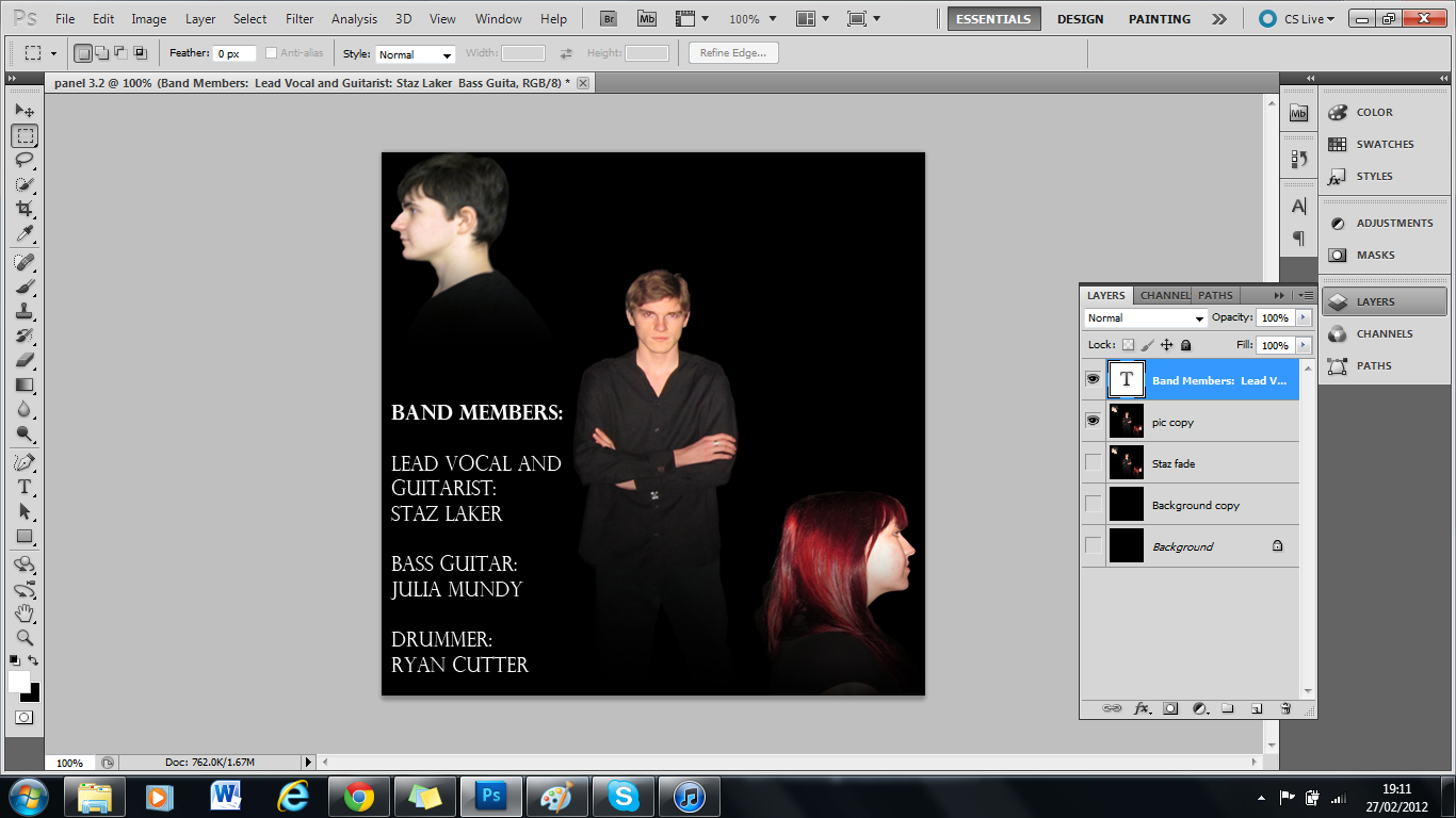
I added the first part of the text that outlined the names of my band and their role. 

The final text was some information of the band, unfortunately due to a lack of real information from the band, Interstate I have made some information based on the lyrics to their songs and the themes of those songs. 

My final panel, although the text type may be subject to change. 

 Edit: Many people thought there was too much writing so I took it off and kept the names of my performers. 


Sunday, 26 February 2012

Completed Panel 1 - Digipak


White


Note: Final design is the white title 
I did originally do the title in black but after looking at different colours I decided to use white instead. 

Photoshop of Panel 1

This is the picture I decided to use, I liked this background more than the grass, stone or concrete as it gave a feeling of death and destruction better with the dead grass and dirt. I wanted the tags completely in the picture because it gives the appearance of loneliness and having been left behind, which does sometimes happen in war if a body cannot be recovered. The connotations of the tags being left behind reinforce my anti-war ideology and the dead grass and soil are very representative of a battleground where the land has yet to recover.  


First I changed the colour so the soil looked darker which made the tags stand out as they are shiny and brightly coloured in comparison. 


Next I changed the hue and saturation of the image to draw out some of the colour and give the grass a dead look, it also darkened the soil more but made it look slightly greyer at the same time, making the tags stand out more.  Although the tags are slighted darkened as well they still stand out as the brightest object in the image. In my final design the tags should look well used and aged rather than new to suggest to the audience that the soldier who they belonged to was mature and well versed in war, implying that no soldier is immune to death, even if they have survived a long period of time in it.  


I started blurring the edges of the image to suggest memory (the lack of colour also reinforces this idea). I layered the image, adding different amounts of blur on each layer so it increases as it moves towards the edge, but without blurring the central image. 


This is the complete blur effect; it is not too drastic but just enough to be noticeable. It also draws the audience’s attention to the centre of the image, to the dog tags. 


I isolated the tags to age them by darkened the edges and accenting the lines on the metal, I then slightly blurred the tags so the dark edges looked more aged. The aged tags are more emotive than the shiny new tags that the image showed before.  


I merged the aged tags onto the image. 


I added the album name ‘Dead Eyes’ to the tags. I added each word separately so I could manipulate each word so it was in line on the tags as the angle was different for each of them. I used grey text so I could give the look that the tags had been engraved. 


I edited the words and used ‘Bevel and Emboss’ and ‘Contour’ to make the words look like they had been engraved. 


I used my logo font in a separate Photoshop window and edited out the white around the lettering so just the black would show up. 


I pasted the logo text onto the image and chose the bottom right corner to place the logo as it had space to fit the logo neatly. I originally had a DPM camouflage pattern instead of black lettering; however when I pasted it onto the image the logo was unreadable so I decided to use a bold colour so it can be seen and read.